Posts tagged 'Climate change'

Blog main page RSS icon

UK electricity generation on 22nd May was fairly typical for a reasonably sunny summer's day.

Gas generation was low in the middle of the night because demand was low. As the day started, demand increased and gas generation increased but was limited as solar generation ramped up. Then as solar dropped off but demand remained high in the evening, gas generation went up yet again. You can see this repeating on most sunny summer days.

Now imagine we had twice the solar capacity we have today. We'd actually be able to turn off gas power stations in the middle of the day. That would be a pretty big deal in itself. But now imagine we had enough battery capacity to store the excess solar energy so we don't need to turn the gas power stations on for some of the evening hours. Keep on ramping up solar capacity and we'd eventually be able to store enough electricity for the evening and the nights, refill them during the day and keep going. We could go days without using fossil fuels.

Anti-renewables people often say "what happens when there's no sun or wind?". Even reasonably pragmatic people will say something similar. It's not an unreasonable point to make, in the middle of winter we can go days or weeks with little sunshine and not much wind and we'd need an absolutely huge fleet of batteries to deal with that scenario. But the batteries required to deal with getting from one sunny day to the next is much smaller. Even in the famously grey and gloomy UK, it's probably something that's worth doing. 

There's a politician in the UK who has a simple solution to every problem. His last simple solution to our problems was to leave the EU, it would appear that didn't fix everything because he's back with some more simple solutions. One of them is to dump renewable energy and get back to good old reliable fossil fuels. Like with all his solutions it's based on a half truth at best. This site gives a breakdown of where the money from our electricity bills goes and in 2025 about 20% of our bills go on some kind of renewables subsidy. But go back to 2022 and closer to 5% of our bills were going to renewables because the price of gas was driving the wholesale price of electricity and gas prices had shot through the roof. Even in 2025, the biggest part of our bills comes from the wholesale price of electricity, which is still mainly driven by the price of gas.

But what will happen in the future as more and more renewables come online? We can make a good guess by analysing the generation data from NESO and the price data from Exelon. I've taken the data for 2025 and here's a graph of electricity price against the percentage of fossil fuels being used to generate it.

That big spike in price between 50 and 60 percent squashes the graph so it's difficult to see what the trend is from this graph, but I put it in because it show a couple of interesting things. First is that the price of electricity can fall below zero, but it only ever happens when we have a lot of renewables online. I guess it might be a good time to invest in batteries, charge them when prices are low or negative and and sell the electricity when prices have gone back up. The second thing to note is the insanely high prices when we don't have renewables available. That's gas fired power stations making a killing because they can...

So if we put this data in buckets of 10% we can get a clearer picture of what's going on

This makes it pretty clear that as less fossil fuels are used to produce electricity, the price drops. Building more renewable capacity and batteries will put us on the left of the chart more frequently so prices in general should be lower. I will caveat that statement by saying I am no expert on the workings of the electricity market, so can't guarantee things are that simple...

Contains BMRS data © Elexon Limited copyright and database right 2025

Supported by National Energy SO Open Data

I've added a new page to the website that provides some data on UK electricity generation. There are a few hopefully interesting graphs and some monthly CSV data you can download. It gets updated daily so you can see how the energy transition is progressing. Let me know if you'd like to see anything else included

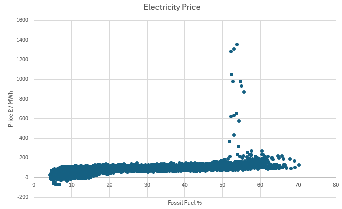
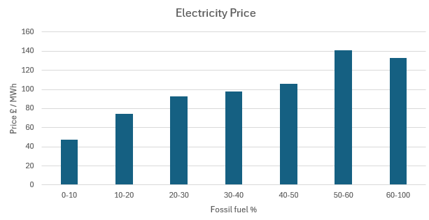
There is a problem with renewables. They are meant to be cheaper than fossil fuels, but as we add more of them our electricity prices have been rising. This has led to some of our politicians claiming the price rises are due to renewables themselves, which seems to make some sense. Doubling up our electricity production so we have renewables for when it's sunny and/or windy and gas/nuclear for when it's not seems like it could be a more expensive option. So let's not worry about climate change and don't bother building any more renewables. Right?

Except that's not what's happening. With our current level of renewables, we are never turning off some of our gas powered stations. And electricity in the UK is priced at the level of the most expensive producer, so it is always tied to the price of gas. And the price of gas shot up after Russia's invasion of Ukraine and is still higher than it was previously.

But, perhaps reasonably, some people will be sceptical of this explanation until they see their electricity bills falling. So I thought I'd try to figure out when we should see gas falling out of our generation mix. I downloaded the historic data from NESO and did some simple analysis of it

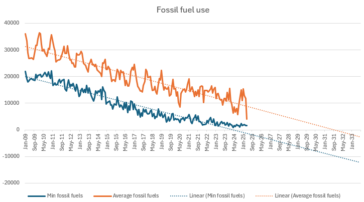
For every month, this shows the minimum and average usage of fossil fuels over a half hour period, both with a linear trendline, which mostly fits the data sets.

The first milestone we should hit is a period of 30 minutes where we don't use any fossil fuels. The linear trendline suggests we should have already hit that milestone, but the drop seems to have stalled over the last couple of years. Maybe someone with a better understanding of the National Grid can explain why that has happened, but it seems like something we'd want to happen as quickly as possible from the consumers' point of view. I think that possibly from the government's point of view it may not be something they'd like to happen too soon. From my understanding, renewables get a fixed price for their electricity, if the wholesale price goes below that price, the government pays the difference. 

The next milestone will be when the average fossil fuel usage gets to zero. That trendline is looking linear at the moment but I'd expect that to flatten as it approaches zero. In long periods of low wind and sun, storage is not going to be able to meet demand. So maybe it's better to look at renewable electricity production. 

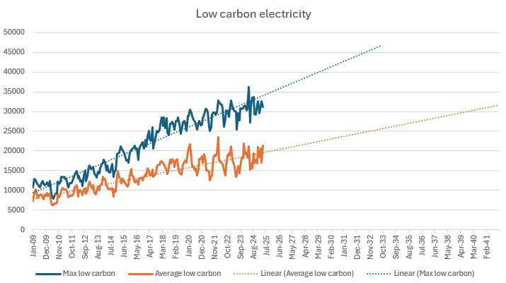
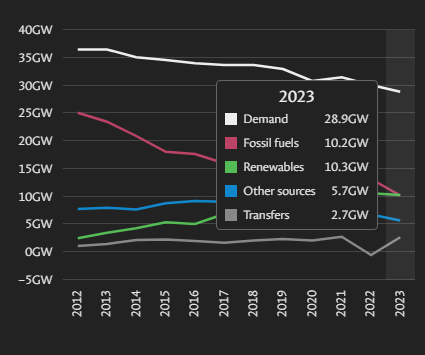
The NESO low carbon figures include nuclear, wind, solar, hydropower and biomass (eugh) and the maximum and average are displayed above. The UK typically requires about 30GW of electricity and the trendline suggests we'll reach that average level in about 2039. Then we'll be producing enough electricity by renewables to meet our needs but some of that will be getting exported when we are producing too much so we will probably still be using gas for some periods. My understanding is that is the definition the government is using for a green National Grid which they hope to reach by 2030, so our renewables output is really going to need to step up a few gears in the next few years to reach that goal.


Supported by National Energy SO Open Data

This seems like a big milestone. Electricity produced by renewables in the UK in 2023 is higher than electricity produced by fossil fuels. Hopefully the wind will continue to blow for the rest of the year and keep it that way. Source

Before this summer, climate change had always seemed a rather abstract concept. I knew it was happening and I knew we had to do something about it, but it appeared to be a gradual process that would take decades to play out.

Then large parts of the world started burning. And other places were suffering from catastrophic flooding. As I read about these disasters, the algorithms decided to show me even more related stuff, like the graphs of sea and land temperatures and the climate records being broken on a daily basis and the future started to look increasingly dark.

I went in search of positive climate news and the increasing use of EVs along with the increasing use of renewables to generate electricity gave me some hope for the future. This post gave me the idea of automating the calculation of the equivalent MPG of an EV. I liked this comparison since we are all familiar with the MPG for a fossil fuel car. So here you can calculate the equivalent MPG in terms of emissions and also cost.

Plugging in some numbers for the UK suggested owning an EV is a good thing for the environment and for your pocket. Even for the dirtiest countries (I'm looking at you Poland), running an EV is probably equivalent to running a fossil fuel car and will only get better as we transition to cleaner sources of energy. Of course, not using a car for journeys is an even better option 

Posts on the old blog tagged 'Climate change'